When I built TinyPivot, the goal was simple: give developers a lightweight way to display, filter, and pivot their data without the bloat of enterprise solutions. Grid view for raw data exploration. Pivot view for aggregated insights.
But there was always a missing piece: visualization.
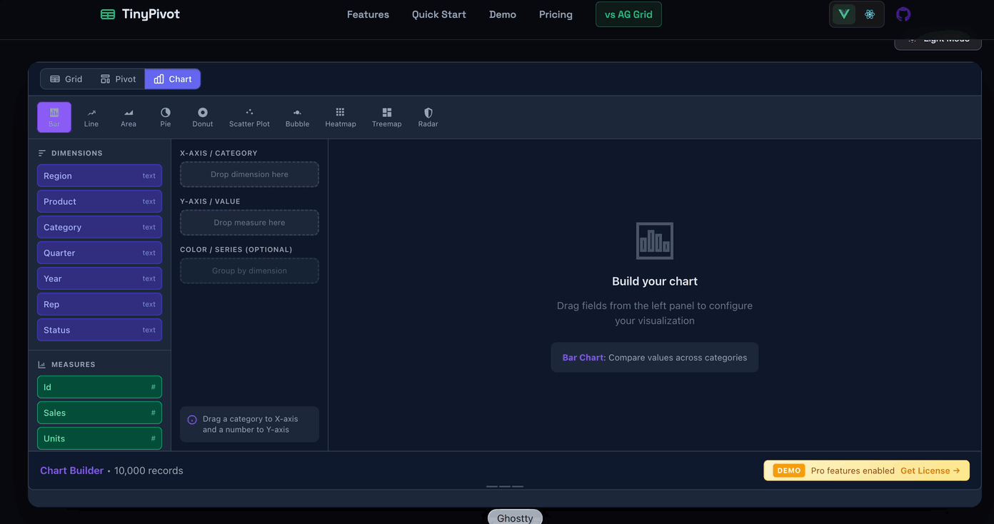
Today I’m excited to announce Chart Builder — a new view in TinyPivot Pro that lets you create beautiful, interactive charts from your data with drag-and-drop simplicity.
The Third View
TinyPivot now has three ways to look at your data:
- Grid — Your classic Excel-like data table with sorting, filtering, and cell selection
- Pivot — Drag-and-drop pivot tables with aggregations and totals
- Chart — A visual chart builder with 6 chart types
Each view shares the same filtered dataset. Apply a filter in Grid view, and your Pivot and Chart views automatically reflect that subset. No configuration gymnastics needed.
6 Chart Types
Chart Builder supports the visualizations you actually need:
| Chart Type | Best For |
|---|---|
| Bar | Comparing categories, rankings |
| Line | Trends over time, continuous data |
| Area | Volume trends, stacked comparisons |
| Pie | Part-to-whole proportions (2-6 categories) |
| Donut | Proportions with a center metric |
| Radar | Multi-metric comparison, balanced scorecards |
Drag-and-Drop Configuration
Building a chart is intuitive:
- Select a chart type from the type bar
- Drag a dimension (like “Region” or “Month”) to the X-axis
- Drag a measure (like “Revenue” or “Units”) to the Y-axis
- Optionally add a series field for grouped/stacked charts
TinyPivot automatically detects which fields are dimensions (text, dates) and which are measures (numbers). No configuration needed — just drag and drop.
Smart Aggregations
When you drop a measure on the Y-axis, you can choose how to aggregate:
- SUM — Total of all values
- COUNT — Number of records
- AVG — Average value
- MIN / MAX — Extremes
- DISTINCT — Count of unique values
Click the aggregation badge to change it. Your chart updates instantly.
Respects Your Filters
Here’s what I love about this implementation: Chart Builder uses your Grid filters.
Filter your data grid to show only “North America” sales? Your chart automatically shows only North American data. Clear the filter? The chart shows everything again.
This means you can:
- Explore raw data in Grid view
- Apply filters to narrow down the dataset
- Switch to Chart view to visualize the filtered subset
- Switch to Pivot for aggregated cross-tabs
All three views stay in sync. No copy-pasting data into a separate charting tool.
Dark Mode Support
Like the rest of TinyPivot, Chart Builder respects your theme setting. Light mode, dark mode, or auto-detect — charts render beautifully either way.
Bundle Size
You might be thinking: “Charts usually mean a huge dependency.”
TinyPivot uses ApexCharts under the hood, which adds about 150KB to the bundle. But here’s the thing — Chart Builder is only loaded when you use the Pro features. The core TinyPivot library stays under 40KB gzipped for free-tier users.
Try It Out
Chart Builder is available now in TinyPivot Pro. Head to tiny-pivot.com to try the demo — click the “Chart” button in the view toggle.
If you’re already a Pro license holder, just update to the latest version:
# Vue
pnpm update @smallwebco/tinypivot-vue

# React
pnpm update @smallwebco/tinypivot-react
What’s Next?
This is just the beginning for data visualization in TinyPivot. On the roadmap:
- Chart export (PNG, SVG)
- More customization options (axis labels, colors, legends)
- Chart configuration persistence (save/load your setups)
- Additional chart types based on feedback
Have a chart type you’d love to see? Let me know on GitHub or reach out on Twitter @bricevallieres.
TinyPivot is a lightweight pivot table and chart builder for React and Vue 3. Get a Pro license starting at $49 — one-time payment, perpetual license.